EVM or Earned Value Managements provides a robust and highly quantitative way of measuring project performance.
On a single dashboard, you can answer five key questions:
- Is the project ahead or behind schedule?
- How much work has been completed?
- How much money has been spent?
- What is the total cost projection to complete the project?
- What is the expected duration to complete the project?
This might seem pretty obvious…., but simply using Gantt charts won’t give you what you want, even with a bunch of progress and financial trackers. EVM is different from how many projects are tracked in two ways.
Firstly, EVM doesn’t just capture the current state of a project, but tracks its evolving states over time. This allows you to make projection quantitatively.
Secondly, EVM combines costs with progress into a single metric that is tracked over time. By doing so, not only do you know whether you’re on schedule, but also if you are on budget. For example, a typical Gantt chart can tell you if you are on schedule, but it doesn’t (usually) give you any information regarding costs. You might be behind schedule, but your cost might be on track. Conversely, it is possible that you are under spending, but because the project is delayed, your cost to complete might be over your baseline estimation.
So How does it work?
I’m glad you ask. There are three data points: PV, AC, and EV.
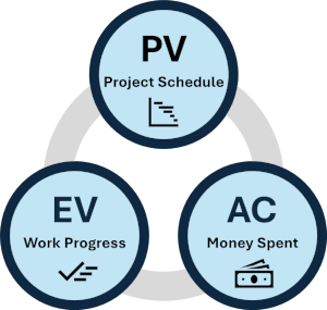
PV or Planned Value
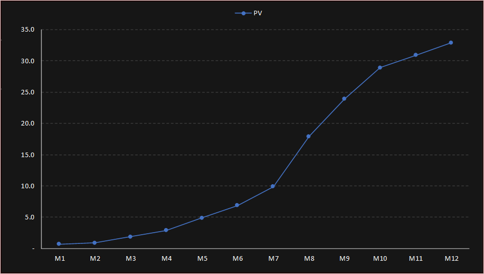
Planned Value (PV) represents the baseline budget for the scheduled work. Tasks within the Work Breakdown Structure (WBS) have assigned budgeted costs, and PV is the time-phased representation of this budget, represented cumulatively.

From the PV, you have two baseline values:
- BAC, Budget At Completion, which is the total budgeted cost of the project. In this example, it is 32.9M USD.
- PD is the Planned Duration. In this example, it’s 12 months.
The PV can be represented in a familiar S-curve.
AC or Actual Cost
AC simply is the accumulated direct costs of the project, tracked over time. This is added to the S-curve.
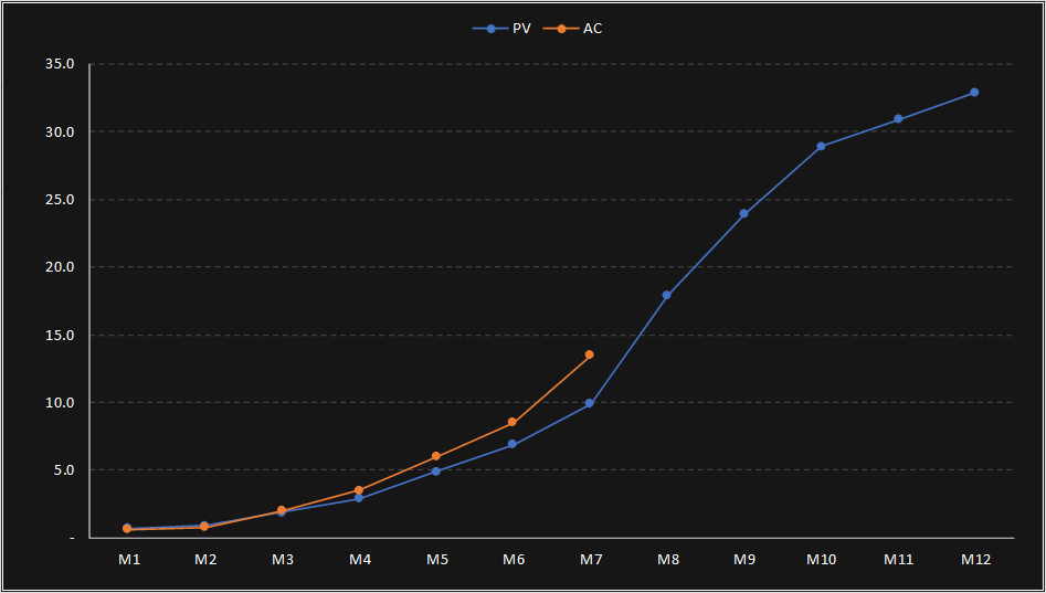
Looking at the example above, you may conclude that the project is over budget. But this is not necessary the case. You might be ahead of schedule.
EV or Earned Value
This tracks the completion of work, similar to how you might do so on a project plan. However, the key point here is to assign cost values to work packages in your Work Breakdown Structure (WBS). This is also added to the S-curve to look something like this.
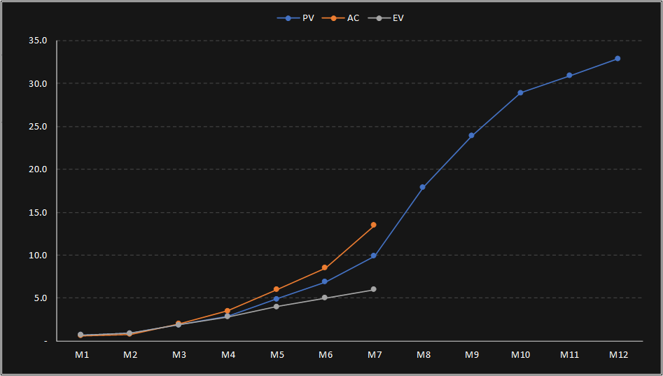
Collectively, by evaluating the relationships between the EV, PV and AC, you can get a lot of information about a project on a single dashboard.
KPIs
“So how do you interpret the graph? It looks kinda’ complicated?” Bear with me…, it will all make good sense.
There are a number of metrics that can be derived from this.
Variances
CV or Cost Variance
Cost Variance or CV is the difference between EV and AC. This is pretty obvious, as you can already clearly see from the previous example that you are spending more that you planned.
SV or Schedule Variance
Schedule Variance or SV is the difference between EV and PV. This is also pretty obvious, as you can see that you are behind schedule, as the EV curve is lagging behind the PV curve.
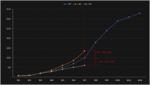
In other words, simply looking at the graph above, you can tell that you are spending money faster than you planned, and you are also behind schedule. CV and SV are simply the variances that quantify this simple observation.
Performance Indices
In addition to tracking variances, you can derive four KPIs.
CPI or Cost Performance Index
CPI describes the cost efficiency of the project to date.
CPI = EV / AC
- if CPI = 1 you’re on budget
- if CPI > 1 you’re under budget, and that’s likely good. But if it’s too high, you might have forgotten something and should investigate.
- if CPI < 1 you’re over budget, and that’s bad.
SPI or Schedule Performance Index
SPI describes the productivity of the project to date.
SPI = EV / PV
- if SPI = 1 you’re on schedule
- if SPI > 1 you’re ahead of schedule, but again, but if is too high, you might have forgotten something and should investigate.
- if SPI < 1 you are behind schedule.
EAC or Estimate at Completion
EAC is the forecasted budget or cost to complete.
EAC = BAC / CPI
EFD or Estimated Final Duration
EFD is the projected duration of the project.
EFD = PD / SPI

So what conclusions can we draw from the example above? The project is in bad shape. The budget was 32.9M USD, and the expected cost to complete is 74M USD. The planned duration was 12 months, but it’s now 19.8 months!
A Quick Recap!
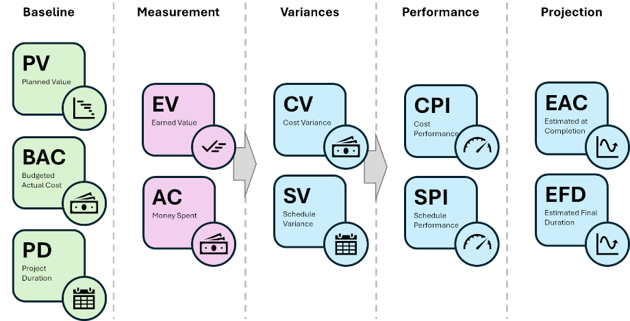
But we are not done yet. But let’s recap.
- You established the PV, Planned Value, that charts out the project baseline.
- With that you have two baseline value:
- BAC, Budget At Completion, which is the budgeted cost of the project
- PD, Planned Duration
- Every month, you track the AC, Actual Cost, and EV, Earned Value, which is work complete.
- From there you can work out 2 key metrics:
- CV, Cost Variance
- SV, Schedule Variance
- You can now work out four KPIs:
- CPI, Cost Performance Index
- SPI, Schedule Performance Index
- EAC, Estimated At Complition
- EFD, Estimated Final Duration
Dashboard
Bulls Eye
Aside from the S-curve, you can plot the CPI and SPI on to a Bulls Eye Matrix. You can plot it as is and it should look something like this.
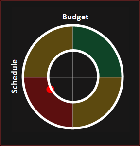
You can very easily see the cost and schedule performance of the project from this simple diagram You can define parameters, such that if the dot falls out of the inner circle, then investigation is needed. You might have two or three bands to take different investigative or escalation actions.
This works, but it’s difficult to plot this in a matrix because the CPI and the SPI can, at least in theory, take on any value greater than zero, and you need the centre to be at CPI = 1 and SPI = 1. Thus I prefer to use a Transposed Sigmoid function so that all values fall between -1 and 1, with 0,0 in the centre.

This function transposes all positive values of x and turn it into values between -1 and 1 on an S-curve that looks something like this. The k value affects how steep the S-curve is going to be.
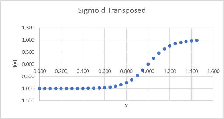
The graph above has a k value of 10. A higher value would result in a steeper curve. By using a sigmoid (or similar) function to normalise your values, you have a standard Matrix. And you can adjust your k value depending on the project, or as a broader company policy for project evaluation.
Tramlines
Another useful visualisation is the KPI Tramlines, that capture the direction of travel of the project.
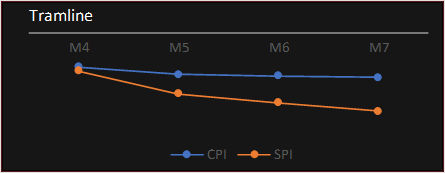
In this case, it’s going in the wrong direction, as both the CPI and SPIs are heading south, and negative.
Dashboard
So if you bring everything together, you have a very detailed dashboard to monitor the overall health of the project.

In this example, the k value for CPI is set to 10, and the k value for SPI is set to 5 for a shallower S-Curve.
In this example, the dot on the Bulls Eye diagram is way off the chart in the red area which means that the project is in full blown crisis mode.
Below are three different scenarios.

You can quickly draw some simple conclusions:
- Scenario 1
- The project is over budget and behind schedule. It is deep into the red region and thus require immediate attention and the project is in crisis mode.
- Under current projection, the budget will be exceed by around 33 percent.
- Cost over spent happened mostly in month 5.
- Need to investigate root cause and implement urgent cost savings actions.
- Scenario 2
- The project remains behind in terms of both budget and costs.
- However, the team has managed to the turn around the project after month 5.
- Continue to closely monitor costs moving forward and maintain efforts to bring cost back to balance.
- Scenario 3
- The project is under budget and ahead of schedule and is expected to be completed in 11 months.
- However, the actual cost is much lower than expected and the team should investigate to make sure nothing has been left out, and that the data is correct.
Final Thoughts
As you can see, EVM is extremely power. If implemented and executed correctly, it gives project managers a high degree of visibility to the heath and performance of a project.
In the next chapter, we’ll look at the challenges associated with implementation and execution.


